IamHere
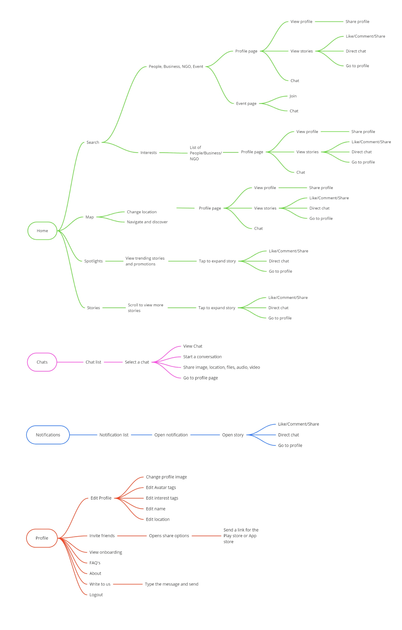
IamHere ( i am here ) is a hyperlocal social network app which enables our users to discover, connect and engage with like-minded people in their neighbourhood. Our users can discover liked-minded people based on their hobbies, interests or profession. Our users can also discover and collaborate with businesses and NGO's near them. IamHere app provides a platform where our users can create multiple Avatars based on their hobbies, interests and business. Our user can post image or text stories, create events, post questions and get answers from people in their neighbourhood or engage with each other directly over our in-app chat. The app has over 100K+ user as of September 2020.
My Role
I was part of the core team which built the IamHere app from the start. I was the Lead UI/UX Designer. As the first and only designer in a fast paced startup, I completely owned the design of the app and I got the opportunity to work on various design fronts like UI/UX, Business and Marketing. I worked closely with the CEO to understand the requirements and come up with user centric features. I planned our ways of working to establish a seamless way to handover the designs to our developers. I worked closely with the developers to communicate to them about the features and to understand their limitations and also to get their feedbacks on the designs.
The Revamp
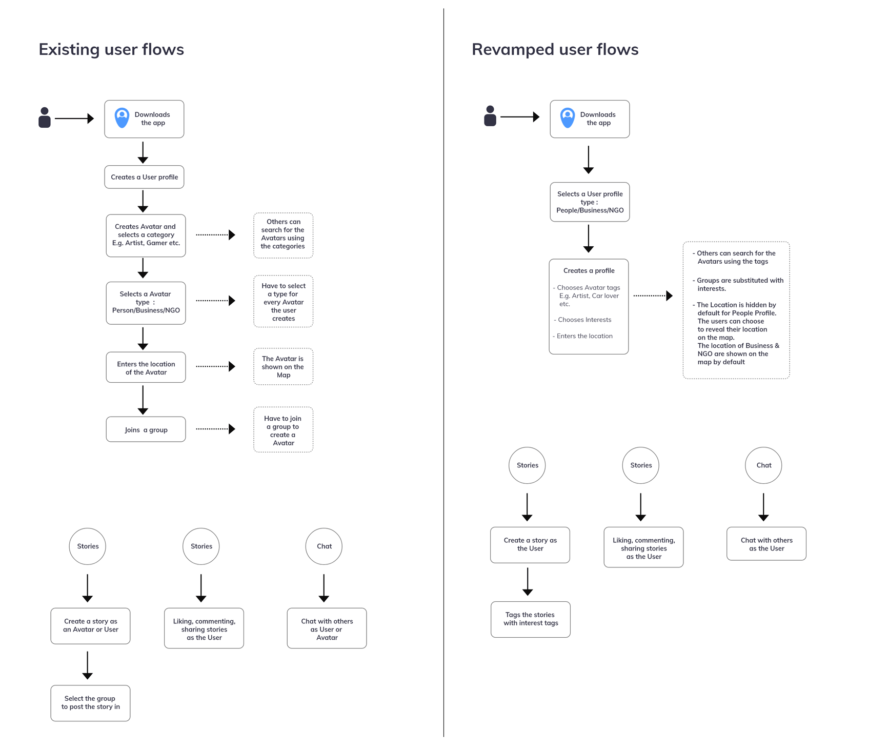
IamHere app has been live since September 2017. Post release, we were constantly learning and releasing minor updates based on our user feedback and our own learnings. IamHere was built on the concept of Avatars. It was done to enable our users to showcase their many facets and interests and also help them to discover and collaborate with like-minded people in their neighbourhood. Businesses and NGO's can also be part of our app by creating business and NGO avatars respectively. Our users could create as many Avatars as they wanted, e.g. Painter, Traveller, Foodie, Book lover, Plumber, Carpenter, Blood bank etc. In order to enable our users to come together and share stories of their Avatars with like-minded people more easily, we created groups and released it in late 2018. For this new feature we came up with the model that, our users have to join a group in order to create a Avatar and have to post their stories in a group. We came up with this model to ensure that the stories of our users reach the right audience and they can connect with like-minded people more easily. The concept of showcasing their multiple facets and interests and the ability to discover and collaborate with like-minded people near them in a closed group was much appreciated by our users. And many of our users had genuinely found new friends in their neighbourhood with same interests. But we also learned that, over time the app had become a bit complicated to use. So we decided to revamp the app and make the user experience as simple and intuitive as possible. As part of the revamp process I began by doing a retrospective of the current app. This helped me to reflect upon some of the decisions which we took previously and realise where we made mistakes and which decisions worked well. Moving ahead in order to identify where the complexities lie, I made a complete heuristic evaluation of the app and I also studied the information architecture of the current app.
The heuristic evaluation and information architecture study helped me to identify the complexities in our app and I narrowed it down to these follows points-
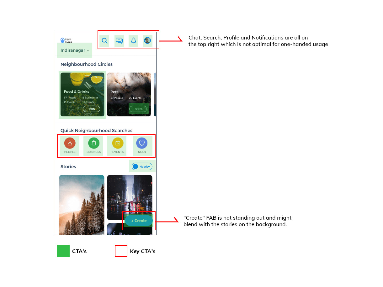
- Too many touch points in the home page
- Create FAB is not standing out
- Chat has less affordance and is lost among other CTAs
- Search needs to be more prominent and visible
- Chat, Search, Profile and Notifications are all on the top right which is not optimal for one-handed usage
We also took feedbacks from our users. Some of the common pain points which they pointed out was-
- Joining multiple Groups and having multiple Avatars was a "bit too much"
- They were not sure as to what the app was when they started using it for the first time
- Story creation was not simple
Ideation
One of the key task of this revamp was to work out a way to maintain our core concepts of enabling our users to showcase their various interests and give them the ability to discover and collaborate with like-minded people, at the same time re work our users experience to remove the complexities and make it simple and intuitive for our users. In order to do so, I decided to focus on four main sections -
- Onboarding process
- Users having to manage multiple Avatars
- Users having to join multiple Groups
- Simplified Home page
Onboarding process
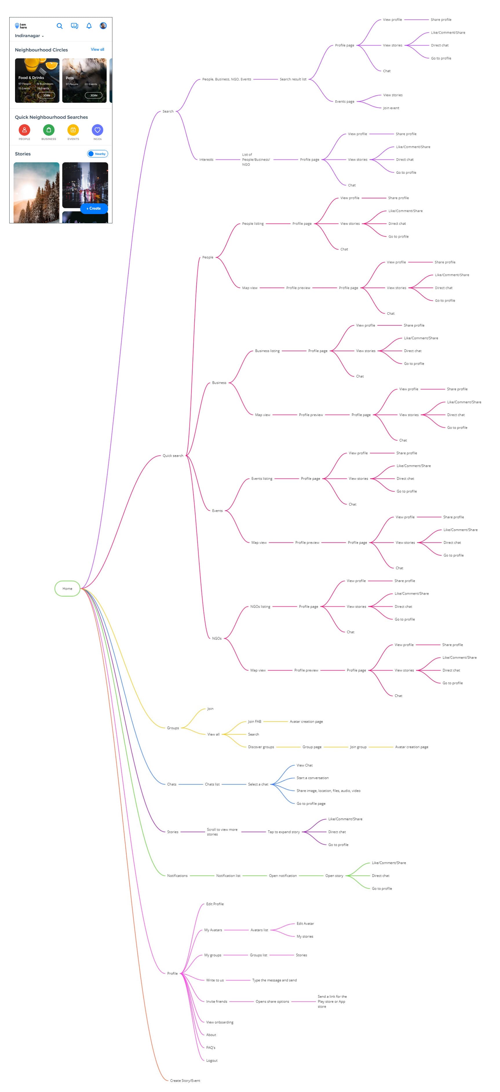
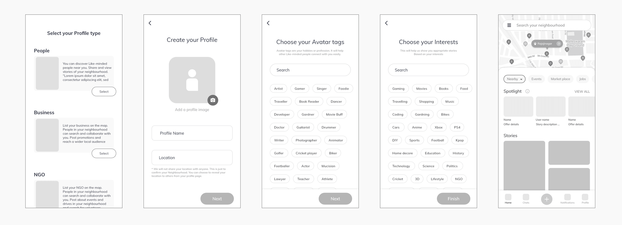
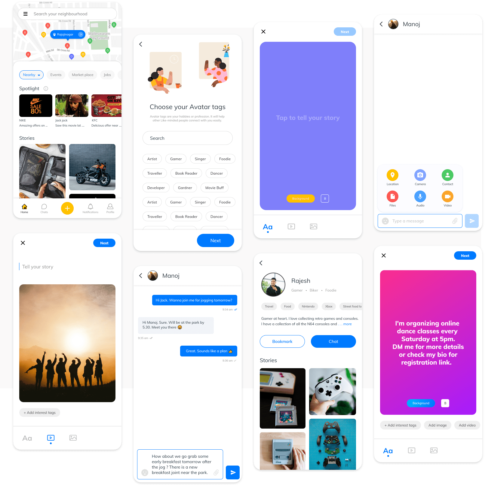
One of the important user feedbacks we received was that some of our users were not sure as to what the app was when they started using it for the first time. So it was very important for us to educate our new users as to what the app is and what they can do with it so that they know what to expect and use the app to its fullest potential. My main goal in re-designing the onboarding process was to make it simple and relatable so that it will be easy for our users to understand what IamHere app is. In order to do so, I began by changing the user flow from the start. I stripped down the complexities in the current onboarding and profile creation process. For the onboarding screens I changed it from a one page onboarding to three pages. Each page dedicated to explain about People, Business and NGOs respectively ( I have written a separate detailed case study for the re-designing of the onboarding screens ). The onboarding screens are followed by a simple profile creation process. The profile creation process incorporated the solutions for the complexities of creating and managing multiple Avatars and also the concept of joining multiple groups.
Having multiple Avatars
IamHere is a hyper local social network app and our goal is to bring the neighbourhood closer and together. In order to achieve this goal we needed to understand the people in the neighbourhood and their mental model. On a general basis we might know our neighbours by their name and profession but we might not know their interests and hobbies. We believed that we can bring people together if we help them see that there are more people similar and like-minded near them. IamHere was built on the concept of Avatars. Creating multiple Avatars enables our users to showcase their many facets and interests and also help them to discover and collaborate with like-minded people in their neighbourhood. But this also introduced the complexities of managing multiple Avatars, creating stories for each Avatar, seperate chats for each Avatar etc. Removing the complexities in having multiple Avatars was a bit tricky. Initially I was exploring multiple option to figure out how to make the process of creating and managing multiple avatars simple. But none of the option were solving the complexity. So I decided to look at the problem with fresh eyes. I tackled it as though IamHere was a completely new app and started to design the UX from the start. This helped me to come up with some radical ideas. One of those ideas was "what if we remove the concept of multiple avatars but enable our users to have multiple avatars 🤨". I built on top of this idea and came up with the idea of substituting the concept of creating multiple Avatars with tagging the user profile with multiple Avatar tags. By doing so I removed the complexity of creating multiple Avatars and in the meantime retaining the ability of showcasing their many facets and interests and also allowing them to discover and collaborate with like-minded people near them. Now the user can just create one profile and tag themselves with any number of Avatar tags and not worry about maintaining multiple Avatar pages, Chats and Stories.
Joining multiple Groups
Groups was an important feature of our app. It enabled our users to have a common place to come together and share stories of their Avatars with like-minded people and also to make the process of discovering like-minded people more easy and accessible. We took couple of key decisions when we released groups. We made it mandatory that our users have to create a Avatar in order to join a group. We took this decision as a "one more step" to make sure that our users are serious and genuinely wanted to be part of the group. We also made it mandatory to post the stories in a group. This was done to ensure that the Avatar stories reach the right Audience. Group was much appreciated by our users but it also introduced the complexities of having to join multiple groups. In order to remove this complexity I substituted the process of joining groups with Interest tags. Now the user can select multiple Interest tags while creating their profile and they will see stories created by other users related to their interests. And when posting a story they can tag their stories with appropriate Interest tags so that it reaches the right audiences. This also ensured that our users can create any interest tags which they see fit and not be confined the finite number of groups available. By making these changes the onboarding process became much easier and simpler. The process of setting up a profile was straight forward. These changes also made the story posting more easier. Now our user just have to post their stories as the user and tag their story with interest tags.
Simplified Home page
Another key finding of the heuristic evaluation was that the home page had too many touch points and main CTA's like Chat, Story creation and Search had lost their affordance. This was not a good user experience as this added a layer of ambiguity to the navigation and might cause confusion to our users.
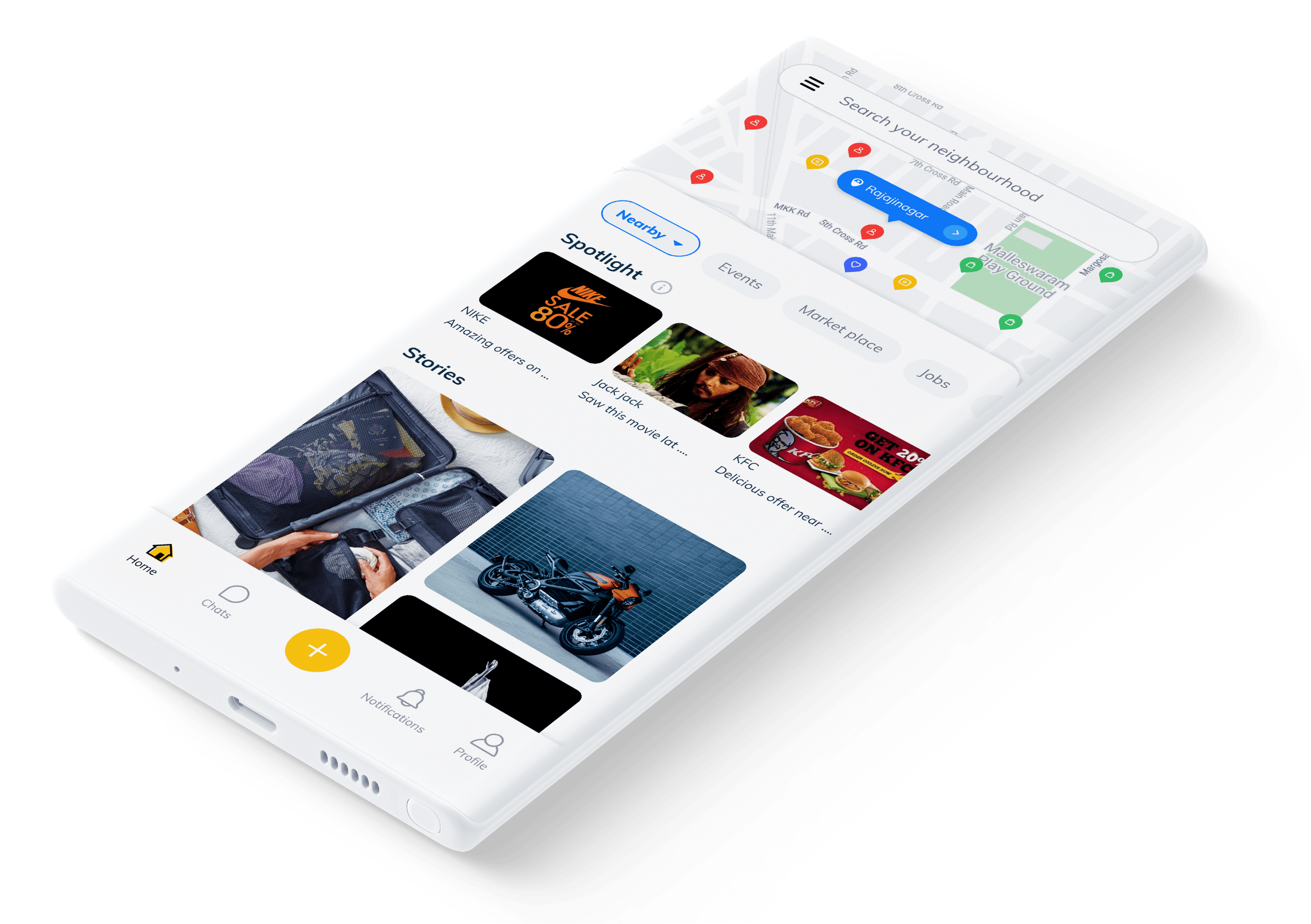
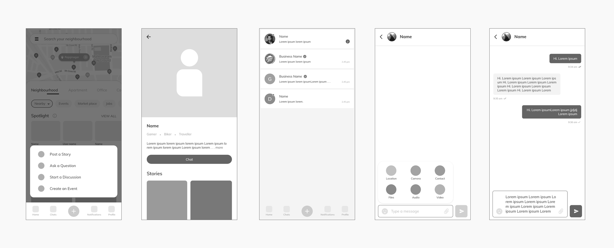
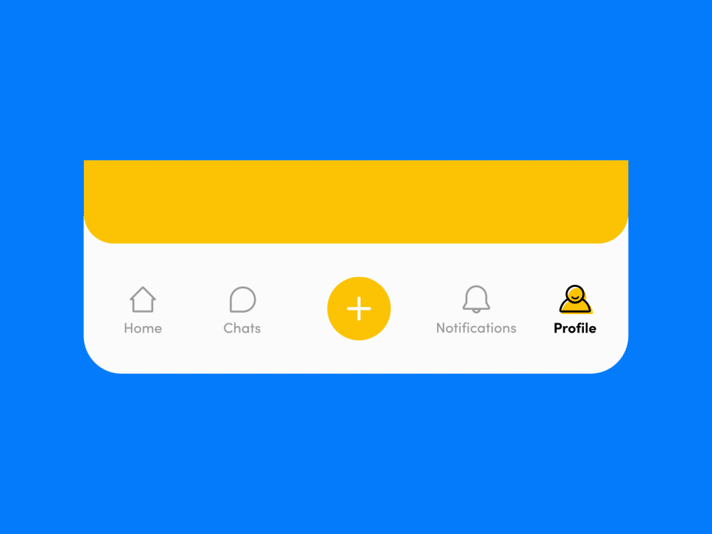
As incremental changes or minor UX corrections to the home page would not solve the problem, I decided to take a holistic approach and decided to fully redesigned the Home page. The main goals was to simplify the navigation for our users, make the key CTA's easy to access and highlight them so that it will be easy and clear to our users to navigate around the app seamlessly. I wanted to reduce the number of CTA's in the home page and keep only the essential CTA's so that our users are not overwhelmed by the home page. As a first step I began by defining the layout for the home page by clearly dividing the home page into sections and giving each section a clear definition and purpose to exist in the home page. I divided the home page into three sections. The first section is the map section. It has a map interface using which our users care explore their neighbourhood and discover like-minded people near them. The second sections is the story section. Here our users can view the amazing life moments of their neighbours in the form of stories. This section is where our users get to know their true neighbourhood and their neighbours. This section is the most important section as most of the interactions, engagement and content consumption happens here. The third section is the bottom navigation section. This section serves as the central navigation hub using which our users can quickly navigate around the app and jump between pages as they want. I added a central create button to the bottom navigation. As story creation and sharing is one of the key features of our app the central position of the create button ensures that our users can easily recognise it and use it instantly when ever they need it.
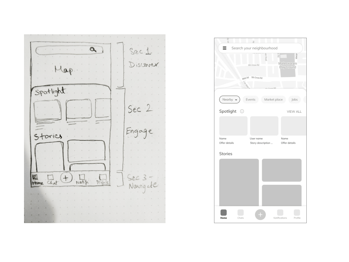
Wireframes
Based on the above decisions I worked on the wireframes. I used Adobe XD to create these wireframes. I could present the ideas to my CEO and developers and get their feedbacks and quickly improve the user flow and user experience.
Using motion to enhance our User Experience
Motion when used in the right way can exponentially improve the user experience. I wanted to introduce motion into our app in the form of micro-interactions. I decided to do it in an incremental manner and change/add micro-interactions into our app based on our user feedbacks and how our user use the app. I wanted to keep it subtle and did want to over do the animations. I used animations for our onboarding screens to educate and welcome our users in a joyful way. And used motions in animated tabs and plan to create some custom loaders for our app.For the bottom navigation I wanted to keep the icons simple and recognizable for our users. For the animations on the icons I kept the transition animations simple and within the context so that it can be relatable to our users. The icons where designed in Illustrator using shape layers and were animated in After Effects.
Visual design
Based on the feedbacks and fine tuning of the wireframes, I next started on the visual design of the app. Some of the key rules I set to myself while creating the visuals were-
- Clearly differentiate elements using white space
- Clearly show the CTA's by giving them the right affordance
- Do not overwhelm our users in any of the pages
- Clear and simple navigation
- Consistent design language
- Consistent icon design
Closing thoughts
This project was a special one, as it was me reworking on my own work. Since the app went live we have been constantly learning and evolving and in the same time finding out the problems in the app. A revamp was long overdue because we had to settle for small corrections and iterations as we were short on resource and time. This revamp gave me the perfect opportunity to take all the learnings from the past two years of the apps lifetime and implement it. We were little unsure of changing the navigation with a bottom nav, as it was a huge change, both visually and from a UX point of view. So we made UI changes to the current app and implemented the bottom nav to see how our users like it and adapt to it. The response has been very positive. We have seen a significant increase in the number of stories being created and the engagement within the app.Currently the app is being completely rebuilt using flutter with the new UI and UX and is estimated to be released by January 2021. I am really excited to see how our users respond to these new changes and the new learnings instore for me.