IamHere Onboarding
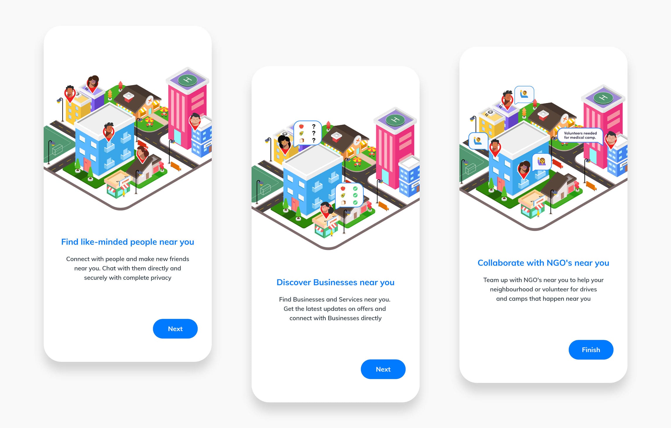
Iamhere app is quite different from other social networking app. It focusses mainly on the neighbourhood and how to connect the People, Business and NGO's of the neighbourhood together. In order to do so the experience of the app had to be different. So it was very important to educate and communicate to our user about how People, Business & NGO co-exist within this one app and also highlight the feature of the app and what to expect from it. Onboarding screens were the perfect place to do this, as it was the first screens any new user would see and we wanted to set the expectations right to our users so that they could ease into the app features and use the app more easily. This would also help us to reduce the learning curve for our new users. As part of the app revamp the onboarding screens were also fully overhauled.
Ideation
My main goal in designing the onboarding screens was to make them simple and relatable so that it will be easy for our users to understand what IamHere app is and the useful feature the app provides. We decided to limit the number of onboarding screens to three so that we do not overwhelm our users with lot of information and make the onboarding journey a short one so that our users can quickly jump into the app. We wanted to concentrate on the three main pillars of IamHere app, People, Business and NGO. To educate the user about the app in just three screens was a challenge. The information shown in the onboarding screens needed to be short and effective. So I decided to make the onboarding screens relatable to our users so that they can easily envision themselves using the app in their day to day life as per their needs. The best way to do this would have been using an Explainer video. But keeping in mind the app size and the network data consumption for our user I decided to do it using short animated stories using Lottie. Since people made up about 70% - 75% of our user base I decided to tell the story from their point of view.
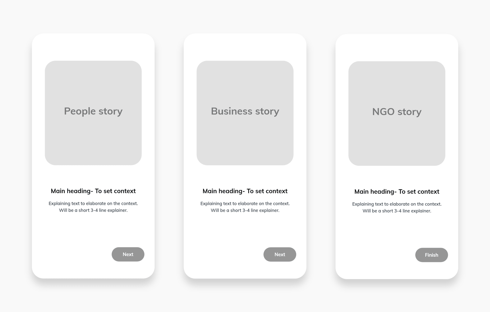
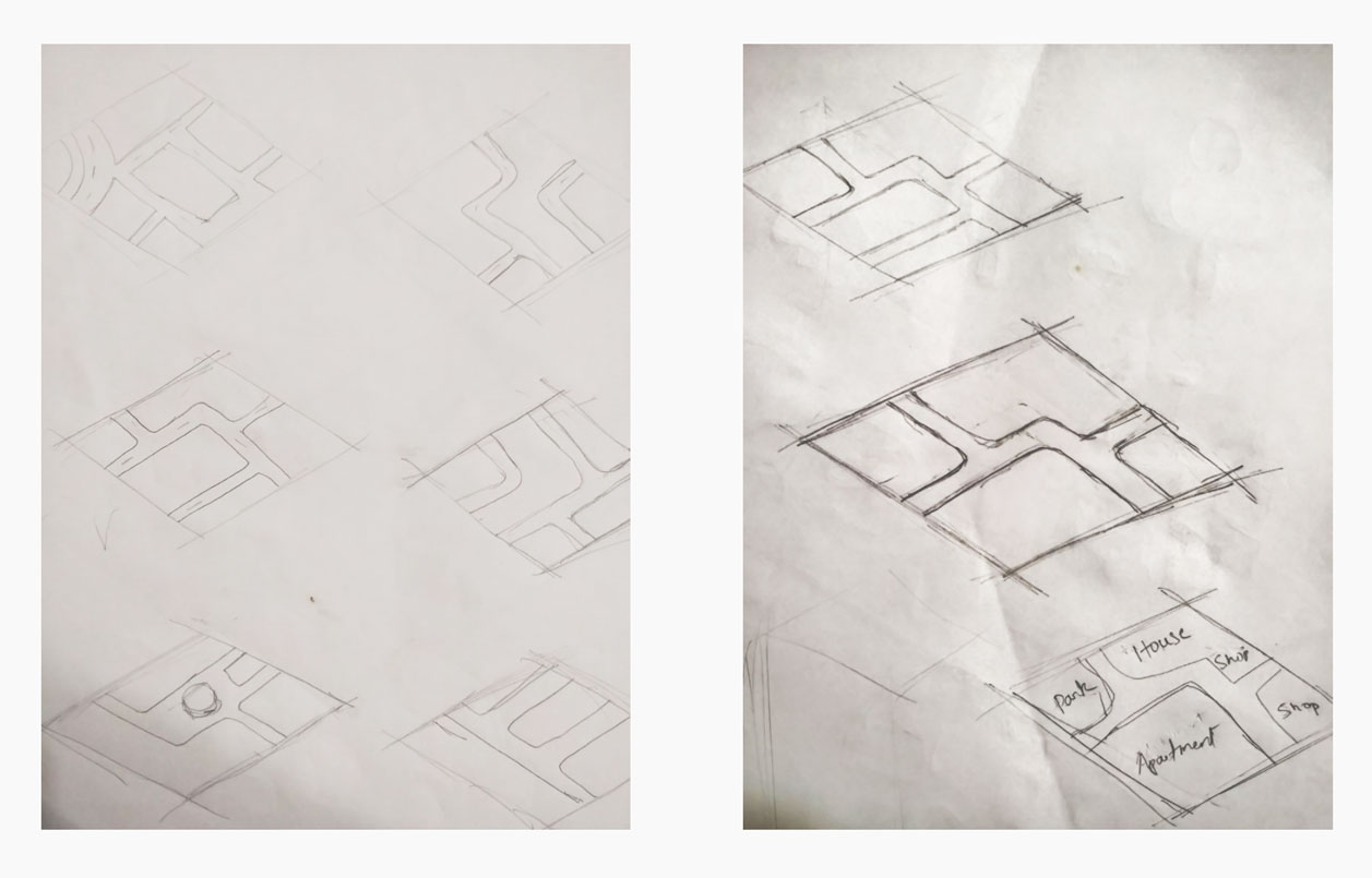
The first screen will be about people discovery and connections. Here I wanted to highlight the ease in which our user can find like-minded people near them and connect with them. The second screen will be about the ease of business discovery and connecting with them. The third screen will be about collaboration between NGO's and people. After deciding on what we wanted to communicate in the onboarding screens the next question to solve was, how to communicate it. IamHere is all about the neighbourhood and the discovery and connections between people, businesses and NGO's. I wanted to showcase this greatly in the onboarding so that our users could envision themselves discovering their neighbourhood and creating new connections around them. The next steps was to sketch out a rough storyboard for the animated stories. During this process I realized the scope of the neighbourhood could not be justified using a 2D illustration. So I decided to design the animation in a isometric form. I had worked previously with isometric designs but not for animations. This was a great opportunity for me to try isometric form in animation. To begin with I had to define the base structure of the neighbourhood in the isometric form. Basically I had to fix the design and shape of the roads, land and any water bodies if needed. I sketched out rough versions of the base structure before zeroing down on one and sketched out a detailed base structure.
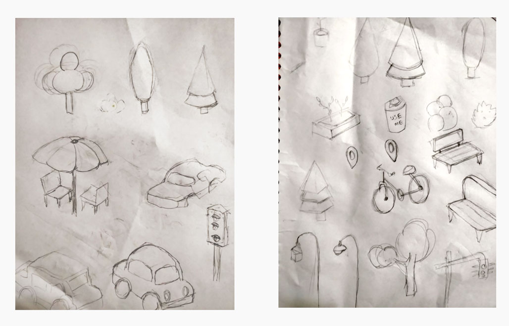
As the next step I sketched out the basic elements in isometric form to fill the neighbourhood. Elements like chairs, streetlights, cars, bikes, trees etc. I did this so that I could keep an account of all the element to add to the illustration so that I can structure my illustration process to accommodate these elements.
Illustration
I began by creating a mood board and I took a lot of reference from dribbble and pinterest. I referred both 2D and 3D city/neighbourhood illustration for my mood board. I wanted the neighbourhood to feel lively and lived in so that our users could easily relate to it. Another challenge I faced was, I had to decide upon the scale of the neighbourhood. Since the primary device where our users will be viewing the onboarding is mobile phones the isometric neighbourhood's scale was a very important factor to consider. If I add too many buildings and elements to the illustration, it might look and feel like a lively and lived in neighbourhood, but when viewing this illustration on a mobile phone, it looks very crammed and it is little difficult to distinguish between the elements in the illustration. This might overwhelm our users. On the flip side, if I add very minimal number of buildings and elements, the feeling of a lively neighbourhood might not be achieved. So I had to design the illustration with the correct balance.
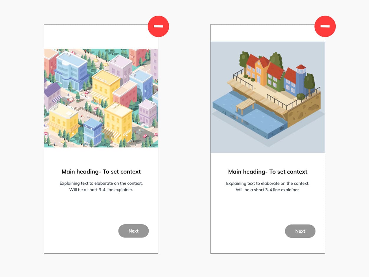
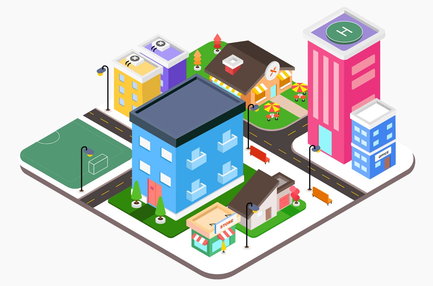
In order to have the correct balance I first had to zero down on the essential elements needed to be present in the illustration and since it's a isometric space, some of the elements might get placed behind other elements, so I had to figure out the placements of these elements as well. Once I had a rough idea of all the elements and their placements I began designing the illustration. I used Illustrator to design the isometric neighbourhood. Since we will be using lottie to enable us to play the animated short stories in our app, I designed the illustration completely using basic shapes. This helps us to convert the entire illustration into shape layers in after effects, which are natively supported by lottie.
Animation
I created a rough story boards before I started the animation process. Since the neighbourhood illustration was ready I could easily envision the stories based on it. I built the stories based on the following ideation
- People story - Highlight the ease in which our user can find like-minded people near them and connect with them.
- Business story - Highlight the ease of business discovery and connecting with them.
- NGO story - Highlight the collaboration between NGO's and people.
After multiple iterations and options I decided on a story line. The goal here was to come up with a story which is simple yet conveys the above messaging to our users, the main theme being discovery and collaboration. The animation process was straight forward. I had all the required assets ready and had a story chalked out. One of the important factor to consider here was duration of the animations. I kept a maximum limit of around five seconds. While creating the animation for the story line I had in mind, the duration exceeded well over the maximum limit. I had some dialogues/chats planned for the characters, but quickly realised that it was too much and increased the duration significantly. I had to trim the story down to its basics. So I decided to replace these chats between the characters with emojis 😉.

Closing thoughts
Working on this project helped me learn new design techniques and improve my process of creating isometric illustrations. But more importantly, I learned that there is a slight impact on the file size of the JSON files exported when isometric illustrations are used in them. It is due to the number of shape layers involved. On my first export with just the neighbourhood and no animations, the file size was 528 KB. I had to optimize the illustration by removing extra shape layers which were hidden behind other elements and reduce the dimensions of some layers. This helped me to bring down the file size with animations to 520 KB. The final file size's were 520 KB, 609 KB and 602 KB for the people, business and NGO story respectively. This increased the APK file size by 1.7 MB. My developer had agreed for a maximum 2 MB increase. So it was within the limit. But I expected the file sizes to be even smaller. I will have to work on this in my future projects and figure out a way to reduce the file sizes of the JSON even more when working with isometric illustrations. Overall this project was a great learning experience for me.